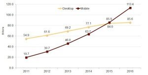
Mobile web browsing has been on the rise for the last 2-3 years. As smart phones become more capable of performing the same activities as desktop computers, more users are switching to iPhones and Android phones rather than relying on laptops and desktops. Google has been monitoring this trend for quite some time and published a short report entitled “Mobile Internet & Smartphone Adoption” which contains statistics about mobile device usage. In their research, Google found that more consumers use mobile phones than computers in the U.S, UK, Germany, France, and Japan. In order to reach customers and to avoid lagging behind competitors, businesses need to be mobile ready.

According to the data provided by Google, overall mobile phone usage trumped desktops/laptops in all 5 countries.
U.S
- 76% mobile
- 67% laptop/desktop
UK
- 89% mobile
- 75% laptop/desktop
France
- 80% mobile
- 79% laptop/desktop
Germany
- 73% mobile
- 72% laptop/desktop
Japan
- 96% mobile
- 86% laptop/desktop
Mobile search is also increasing significantly according to Pingdom. The worldwide growth of mobile web browsing has been great, but Africa in particular has seen tremendous growth. From 2010-2012, Africa experienced a 155% increase in mobile web browsing from 5.81% in 2010 to 14.85% in 2012. Additionally, many of the countries with the most mobile traffic (phones and tablets) as part of total web search are in Africa:
- Zimbabwe- 58.06%
- Nigeria- 57.89%
- India- 48.24%
- Sudan- 45.32%
- Zambia- 44.24%
Mobile devices have been getting much more use for local searches in particular. Microsoft Tag reported that 50% of all local web searches are performed on mobile devices.
Your first step towards mobility- A responsive web page
With these statistics, it is apparent that companies need to take advantage of mobile devices. One of the first changes companies can make is to ensure they have a mobile friendly version of their website, also known as a “Responsive” site. What this means is that the layout of your website is displayed differently depending on size of the screen it’s being viewed on. In other words, the way your site responds changes when it’s viewed on a smart phone, tablet, or desktop computer. This gives mobile users an easy a no excess scrolling, no tiny fonts, easy to view site.
Mobile websites are a more streamlined version of the full site. This enables pages to be displayed aesthetically and more importantly, mobile friendly sites load faster. On average, 74% of users only wait 5 seconds for a page to load on their mobile device before they exit. Also, 46% of consumers are less likely to go back to a site on their mobile device if it didn’t work correctly on their previous visit.
How consumers are using mobile devices
A large portion of the increase in mobile device usage is attributable to the capabilities that mobile devices have today. Here is a breakdown of how people are using their mobile devices:
- 61%– Gaming
- 55%– Weather
- 50%– Maps/Search
- 49%– Social Networking
- 42%– Music
- 36%– News
With the help of mobile apps, nearly any activity that’s performed on a desktop can be done on a mobile device. The travel industry is one of the best examples of this. In the early 2000’s, there was a huge shift towards booking airline flights, hotels, and other travel arrangements online. Companies such as Hotels.com, Expedia, Orbitz, and Travelocity helped pioneer this movement. Today, those same companies are helping to pioneer the use of mobile devices to handle traveling plans. All of the aforementioned companies have responsive sites and apps that make setting up travel arrangements on mobile devices a breeze.
Mobile internet is no longer just “the future” of technology, it’s here right now. Microsoft predicts that by 2014, mobile internet will overtake desktop internet usage completely. This includes E-Commerce/mobile payments, local searches, social networking, and general browsing. If your company is not set up for mobile devices, it needs to become a top priority right now.
Author
Eran Feinstein is the founder of 3G Direct Pay Limited. 3G provides global e-commerce and online payments solutions for the travel and related industries He is a leading authority in the fields of e-commerce, travel and payments, having acquired extensive experience from various parts of the world.
