Looking to take your business online? The first steps, while exciting, can often feel overwhelming. Thankfully, Wix comes to the rescue, helping you to build your own eCommerce site… even without any technical expertise.
We’ve put together a step-by-step guide to building your online storefront with Wix, so you can get started accepting online transactions quickly and easily.
It’s as easy as:
- Building and customizing your online storefront
- Adding in your catalogue of products and/or services
- Setting up a payment gateway
Build Your Store

Think about your experiences in your favorite brick-and-mortar shops. For most of us, there are a few things that are crucial to a good experience while shopping: the store layout (and how easy it is to find what we’re looking for), the availability of the items, and how easy it is to complete our transactions.
These things are equally – if not more – important in the online world. After all, when entering an online store, customers aren’t met with the friendly faces of their staff. It’s important to ensure that upon visiting your site, potential customers find it easy to navigate to the products or information they need.
Start by considering what impression you want to send from the moment people visit the homepage. Browse some of your favorite web eCommerce sites or businesses similar to yours who have online stores to see how they have set up their homepages – there’s no harm in getting inspiration from sites that “work”!
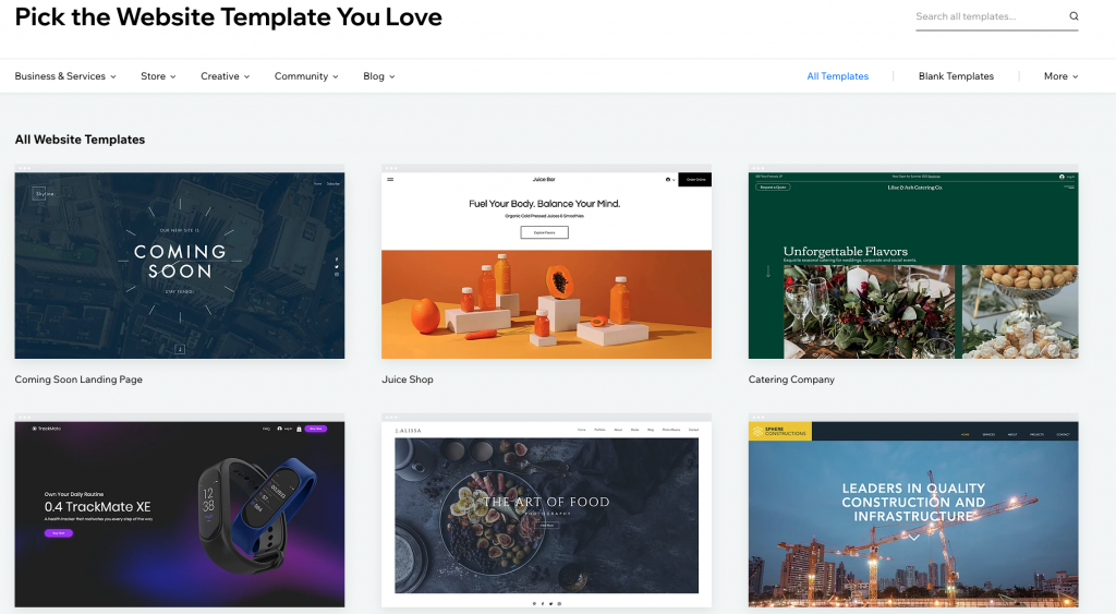
Wix makes it easy to build your store from the ground up, offering hundreds of templates for online stores. The catalogue can be browsed by industry, too, and you can play short demos that give an idea of the browsing experience on the pages of the site.
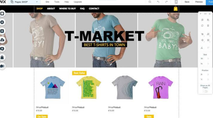
Once you’ve chosen a template, it’s time to customize it to suit the needs of your store. Adding photos and videos is as easy as drag-and-drop, and descriptions are easily customized to match. It’s also a good idea to add contact forms, so customers have a way to reach out with any questions (or compliments!). There’s no need to write any code – though the option is there if you know Corvid and JavaScript – as the interface is entirely visual.
Here are some quick features we recommend, which improve your conversion rate (that is, the rate at which “potential customers” become “happy clients”):
- Call-to-action Buttons help guide customers through the purchasing process. Don’t overdo it, but add buttons along the way to tell people to “Read More”, “Buy Now”, or “Checkout” so you don’t leave them guessing.
- Clear and Easy Menus are essential, as they make it easy for visitors to navigate your site. As you’re uploading products, organize them through menus, categories, and filters so that your customers can get right down to exactly what they’re looking for. Even if your product catalogue isn’t large now, it’s a best practice to adopt early on so you don’t need to backtrack later.
- Easy Checkout means customers know exactly where to access their shopping cart, not only to see what is in it, but to then make a payment. When customers add items to their cart, give a notification (such as a popup, or a number on the cart icon) so they know their action was successful.
- Image Quality is crucial. Product images are not a place to cut corners – having high quality, professional-looking images is one of the main reflections of the professionalism of your website. Ensure you take clear, high-resolution images to add to your catalogue.
- Site Loading Speed can make or break a customer’s patience. Wix websites are optimized for page and image loading times, to ensure customers don’t get frustrated by waiting and head off to another shop.
- Mobile Friendly is customer-friendly – more and more people are making their purchases from anywhere, at any time, from any device, often their mobile phones. Make sure that once you build your beautiful site, you also test it (Wix has a tool for this, too) for mobile displays.
Create Your Catalogue
Now that you have the backbone of your side built, it’s time to add your products into the shop. Filling your digital shelves with products and services can be done one-by-one, or, to save time, by uploading a product list saved in a .CSV file. Wix has created this brief tutorial video, to demonstrate how to add products via a .CSV.
Wix will automatically create product pages for your items as you add them into your catalogue. Storefront templates also come with built-in CTA’s (call-to-action, like “buy now”), making it easy for your customers to make purchases, and the layouts are optimized for the customer journey.
Here are a few tips for creating potent product pages:
Visual Appeal
- Use professional images to display products, and entice customers to buy.
- Show your products from multiple angles to give a good idea of what to expect.
- Activate the zoom feature for a closer look.
- Add an image for each variation, including colors, textures, fabrics, patterns, etc.
- Consider creating product videos using Wix Video Maker to help them really stand out.
- If you’re collecting images the DIY way, learn Product Photography 101 to ensure your photos are professional and impactful.
- Ensure thumbnail consistency by choosing a dimension and sticking to it throughout the catalogue – it looks and feels nicer while browsing.
- Keep powerful CTA’s in mind, ensuring you’re encouraging clicks and purchases with actionable buttons like “add to cart”, “buy now”, or “checkout”.
Friendly Fields
- Ensure your products have relevant fields for making choices, such as color, sizes, or other customizations. Keep these fields straight and to the point, so your customers aren’t overwhelmed.
- Add dropdown menus for variations – for example, if you’re selling a scarf that comes in various colors, use a drop down menu to see all available options and make a selection.
Text that Shines
-
- Use clear product names that will show up when people search your site, or Google.
- Write informative descriptions for products. Use a little creativity when writing descriptions for product pages – paint the picture of how or where your customer would use this item, or how it will help them.
- Decide on a consistent tone, taking your customers and industry into account.
- Highlight the value of your products, by mentioning what makes them stand out. Don’t mention competitors by name, but be clear if there’s an advantage to taking your product over any other option in the market.
- Add in the logistics and practicalities on each product page (following the description) so that customers don’t need to navigate away to get to your shipping, returns, and refund policy page.
Here are some great examples of powerful product pages to inspire you while creating your site.
Added Features
Try adding some additional features to your site, to make it more user friendly. Consider:
- FAQs – with frequently asked questions you get from your customers.
- Live Chat – if you have someone on hand to answer live customer inquiries
- Reviews and Forms – make it easy for customers to submit reviews, and easy for potential customers to find and read them
Accept Payments
So, we’ve covered the placement of the customer’s cart and the importance of making it clear and accessible, so that completing their order is easy to do.
It’s also important to offer multiple payment options, to give your customers the chance to use their preferred payment method. Offering payments via credit or debit cards, eWallets, and even PayPal will ensure you appeal to a broad set of customers. You could even offer to receive payments in a list of currency options.
Options are not the only important aspect – in making purchases online, customers are putting a lot of trust and confidence in you to keep their data safe and secure. So when it comes to accepting payments, make sure you select a payment processor such as DPO, who adhere to the highest standards of security and fraud protection. Keeping customer payment data secure while protecting merchants from fraudulent transactions is a key objective of a reliable payment processor.


